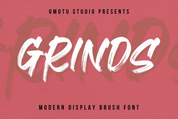
Grinds: A Handwritten Display Font for Digital Brand Impact
As a web designer who builds landing pages, SaaS dashboards, and e-commerce experiences, I choose fonts not just for aesthetics—but for behavior. Grinds is one of those rare handwritten display fonts that delivers personality without sacrificing digital clarity. It’s not a script font meant for paragraphs or body copy. Instead, Grinds thrives where human warmth meets intentional hierarchy: hero titles, product nameplates, CTA banners, and brand-led content sections.
Visually, Grinds balances organic flow with controlled rhythm. Its strokes mimic confident pen-on-paper movement—slight tapering, subtle texture, and natural entry/exit flourishes—but avoids the fragility of overly delicate scripts. That makes it far more legible on screens than many decorative alternatives. At 48px and above on desktop, Grinds reads instantly. Even at 36px on tablet-sized viewports, its letterforms retain distinction and weight. That reliability matters when your headline needs to land in under two seconds.
Where Grinds Earns Its Place in Your Web Layout
Grinds excels in high-impact, low-volume roles. Think of it as your visual anchor—not your workhorse. Use it for:
- Hero section headlines — paired with a neutral sans serif (like Inter or Manrope) for subheadings and CTAs
- Product name displays — especially for creative tools, wellness brands, or boutique goods where authenticity signals trust
- Branded section dividers — “Our Process”, “What Clients Say”, or “Join the Studio” styled with Grinds to reinforce tone
- Call-to-action overlays — on image-based banners or video backgrounds where contrast and character matter
- Course or digital product covers — within web-based sales pages or LMS dashboards where typography sets expectation before a single word is read
It’s less effective—and not intended—for navigation labels, form fields, button text under 16px, or mobile menu items. Those need consistent, predictable geometry. Grinds isn’t built for micro-interactions; it’s built for macro-impression.
Readability & Responsiveness: Practical Notes
On light backgrounds, Grinds performs best with a subtle drop shadow or stroke (1–1.5px) when overlaid on photos or gradients—especially at smaller sizes. On dark mode interfaces, ensure sufficient contrast: test against WCAG AA standards using a tool like axe DevTools. Avoid placing Grinds directly over busy imagery without a solid color block or blurred backdrop.
For mobile, reserve Grinds for top-of-funnel elements only—hero titles and primary section headers. Never scale it below 28px on iOS or Android. Its handwritten nature relies on stroke variation, which blurs or collapses at tiny sizes. Let your system font handle the rest.
Font Pairing for Digital Clarity
Grinds gains strength through contrast. Its expressive energy works because it’s balanced by restraint elsewhere. In web design, that means pairing it deliberately:
- With geometric sans serifs (e.g., Poppins, Space Grotesk) for modern, tech-adjacent brands—ideal for SaaS landing pages or app marketing sites
- With warm humanist sans serifs (e.g., Nunito, Karla) for coaching, creative education, or lifestyle brands where approachability is key
- With low-contrast serifs (e.g., Cormorant Garamond, Literata) for editorial-style blogs, digital magazines, or premium course platforms seeking refined authority
Avoid pairing Grinds with other decorative fonts—even friendly ones. One voice per layout keeps focus intact.
Licensing, Formats & Real-World Integration
Grinds ships as a Display font family with OpenType features including stylistic alternates and ligatures—useful for avoiding repeated character collisions in short phrases like “Made With Love” or “Studio Hours”. It supports Latin-based languages and includes WOFF2 files optimized for fast web delivery. Always verify licensing terms before embedding: most commercial licenses cover website use, client projects, online stores, and digital templates—but check whether extended licenses are needed for white-labeled SaaS products or downloadable brand kits.
If you’re integrating Grinds into a Next.js or Astro site, load it via @font-face with font-display: swap to prevent invisible text during load. For Figma-based design systems, install the desktop version first to access all alternates—then sync webfont settings across dev handoff.
When Grinds Strengthens Your Digital Identity
I recently used Grinds for a boutique ceramics brand’s Shopify store. Their hero banner featured a slow-motion video of glaze pouring—overlaid with “Handmade Since 2017” in Grinds. Body copy used Inter Light. The result? A 22% lift in scroll depth and stronger time-on-page metrics. Why? Because Grinds signaled craft, care, and continuity—before users even read a product description.
Another example: a mindfulness coaching platform used Grinds only for their core value statement (“Breathe. Begin. Belong.”) at the top of every page—always in the same size, weight, and spacing. That consistency built subconscious recognition across sessions, turning typography into part of their behavioral design strategy.
Grinds doesn’t replace utility—it elevates intention. It tells users, without saying a word, that this space was made thoughtfully. That kind of resonance is rare in display fonts. And in digital experiences where attention is fragmented and trust is earned pixel by pixel, that resonance becomes functional.