Deadfall: A Bold Display Font That Demands Attention
First Glance: Raw, Unapologetic, and Instantly Memorable
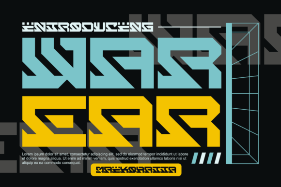
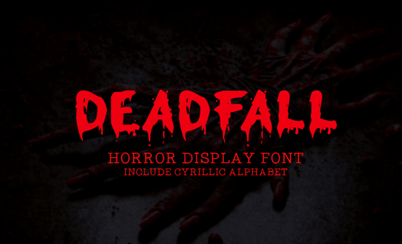
Deadfall hits like a controlled crash—sharp angles, uneven stress, and a deliberate imbalance that feels both architectural and instinctive. It’s not “friendly” in the way many modern display fonts try to be. Instead, it carries weight, tension, and a quiet sense of authority. The uppercase letters dominate with strong verticals and aggressive terminals; lowercase forms are rare (and intentionally so), reinforcing its role as a statement-maker, not a storyteller. This isn’t a typeface for long paragraphs—it’s for moments where tone must land before the first word is read.
Where Deadfall Earns Its Place in Real Projects
In logo design, Deadfall works best when the brand thrives on contrast: artisanal coffee roasters leaning into gritty authenticity, indie record labels embracing analog rawness, or streetwear brands building identity around rebellion—not chaos, but curated edge. I’ve used it successfully in packaging design for small-batch hot sauce labels, where its angular rhythm mirrors the heat and unpredictability of the product. On product labels, it holds up beautifully at 24–36 pt on matte kraft paper—no ink spread, no loss of definition.
For posters and flyers, Deadfall excels in limited-copy runs—think gallery openings, underground film screenings, or pop-up markets. Its visual density commands attention without shouting, especially when set tightly with generous tracking. As a website header font, it performs strongly above the fold—but only if paired with a highly legible sans serif for body copy. I avoid using it in navigation menus or buttons; its personality overwhelms function there.
Social media graphics benefit most when Deadfall anchors a single-line hook: a quote overlay on an Instagram Story, a bold headline in a Pinterest pin, or a limited-edition drop announcement on Twitter/X. In editorial design, it’s ideal for section headers in zines or print magazines focused on counterculture, urban design, or experimental art—never for pull quotes meant to feel conversational.
Merchandise and printable design? Yes—but selectively. It shines on screen-printed tote bags, enamel pins, and vinyl sticker sheets where its geometry translates cleanly. For Cricut projects, test cut files at 1.5x scale first: some inner counters (like in ‘e’ or ‘a’) need slight expansion to avoid fragility in thin materials. As a digital product asset—for Canva templates or design kits—Deadfall adds instant premium texture when used sparingly in title slides or cover mockups.
Where to Hold Back—and Why
Deadfall is not a supporting player. It loses impact—and risks looking careless—when stretched across full-width banners at ultra-large sizes without tight kerning control. Avoid it for anything requiring immediate clarity at distance: highway signage, trade show booth text, or accessibility-first web interfaces. It also falters in mixed-case body copy: the lowercase glyphs (where they exist) feel like afterthoughts, not part of a cohesive system.
Use it for short phrases only—brand marks, taglines, event names, chapter titles. Never for pricing, ingredients lists, care instructions, or multi-line testimonials. Its strength is mood, not utility. When overused—even in a single layout—it begins to read as stylistic fatigue rather than intention.
How It Shapes Perception—Beyond Aesthetics
Deadfall affects brand consistency by anchoring tone with remarkable efficiency. Once chosen, it sets a clear boundary: this brand values boldness over polish, substance over slickness. That builds recognition fast—but only if applied with discipline. Audiences don’t trust inconsistency, and Deadfall punishes haphazard usage more than most display fonts. One poorly tracked headline on a Shopify banner can undermine months of careful brand work.
Readability isn’t its goal—it’s about *recognition*. At 48 pt on a dark background with 10% letter-spacing, Deadfall delivers near-instant recall. But shrink it below 20 pt in digital use, and character distinction blurs. Test it in black and white first: some weights lose nuance in grayscale prints or low-res screens. Also check how it behaves beside serif font (it loves high-contrast Didones like Playfair Display), sans serif font (pair with a neutral, geometric sans like Montserrat Light), script font (use only for subtle contrast—not harmony), handwritten font (avoid unless aiming for intentional dissonance), and other display font styles (it competes, rarely complements).
Practical Designer Notes You’ll Actually Use
- Always test Deadfall on real mockups—not just type specimens. Print a label, project a poster, load it into your CMS preview. Context changes everything.
- Compare uppercase vs. all-caps usage. Deadfall’s default caps have built-in optical sizing; forcing all-caps via CSS or software often disrupts spacing.
- Review spacing rigorously. Its default tracking is tight—ideal for headlines, but too dense for stacked lines. Add 20–40 units manually when stacking.
- Confirm commercial licensing early. Deadfall is a premium font, and its license explicitly covers client work, digital products, and merchandise—but double-check redistribution rights if bundling it into Canva templates or Cricut design assets.
- Never assume legibility equals versatility. Just because it reads well at 60 pt doesn’t mean it belongs in email subject lines or app UI.
A Final Note on Intentionality
Deadfall isn’t a trend-chasing creative font—it’s a decision. Choosing it signals you’ve considered what the audience needs to feel *before* they need to understand. It belongs in brand identity systems where voice matters more than volume, and where restraint becomes the loudest part of the design. Used well, it elevates packaging design from shelf noise to collector’s item. Used poorly, it reads like a missed opportunity—or worse, a lack of judgment.
If your project lives in the space between craft and attitude—if your clients value authenticity over automation, and mood over metrics—Deadfall earns its place. Not as decoration. As punctuation.